
How to Use Portfolio Visualizer
Using data to become a better investor.

Anyone who builds a DIY portfolio should have some data to back up their decisions. One of the best online tools for this is Portfolio Visualizer. By using data analysis, this tool can tell you a lot about your portfolio, including how it would have performed historically, what factors it tilts toward or how it might survive a 30-year retirement.
There’s a free version and a paid version. I will only be covering the free version, as I don’t have the paid version and the vast majority of people will only use the free version. Most of the best tools on the site are free anyway. If you’re serious about portfolio management and ensuring your financial plan is as rigorous as possible, you should know how to use the tools available.
Here are a few things that Portfolio Visualizer can do:
Backtests
Want to know how your portfolio would have performed had you been investing for the past 40 years? You can get an idea by running a backtest. This can help you get a sense of how your portfolio might perform in similar market conditions in the future.
Using the default settings in the Portfolio Model Configuration, we can select from various asset classes to create up to three portfolios to compare. For this example, I’ll use three asset classes: total U.S. market, total international market and total U.S. bond market. These three asset classes compose the classic Boglehead portfolio.
Let’s compare a portfolio of 75% U.S. total market and 25% total international with a portfolio of 60% U.S. total market, 20% total international and 20% total U.S. bond market.
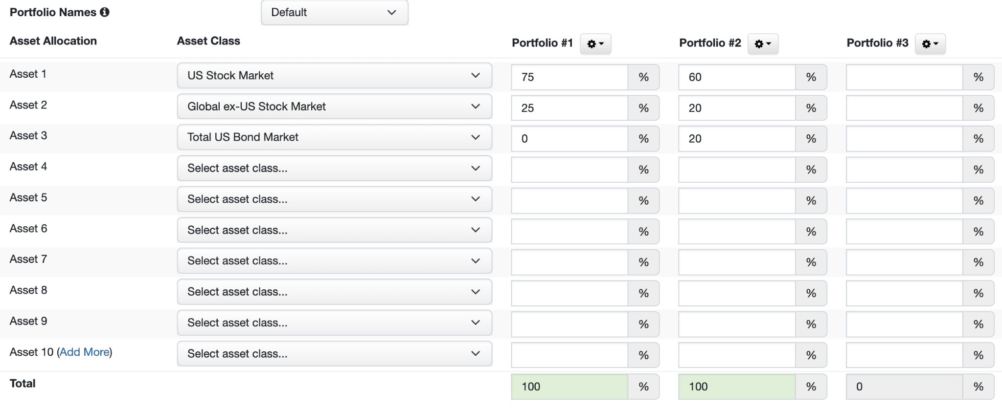
Once you’ve selected your asset classes and portfolio allocations, you can see the results:
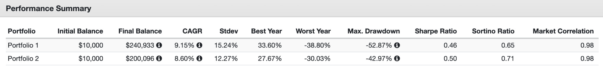
You get a few bits of information. Your final balance, compound annual growth rate (CAGR) and best and worst year are self-explanatory.
You also get the standard deviation and Sharpe ratio of the portfolio. The standard deviation measures the variation in the returns in terms of a percentage. A higher percentage suggests a more volatile portfolio. The Sharpe ratio is a measure of a portfolio’s risk-adjusted return. A higher Sharpe ratio means a portfolio achieved higher returns relative to the risk taken on. This can help you determine if it’s worth it to add more risk to your portfolio.
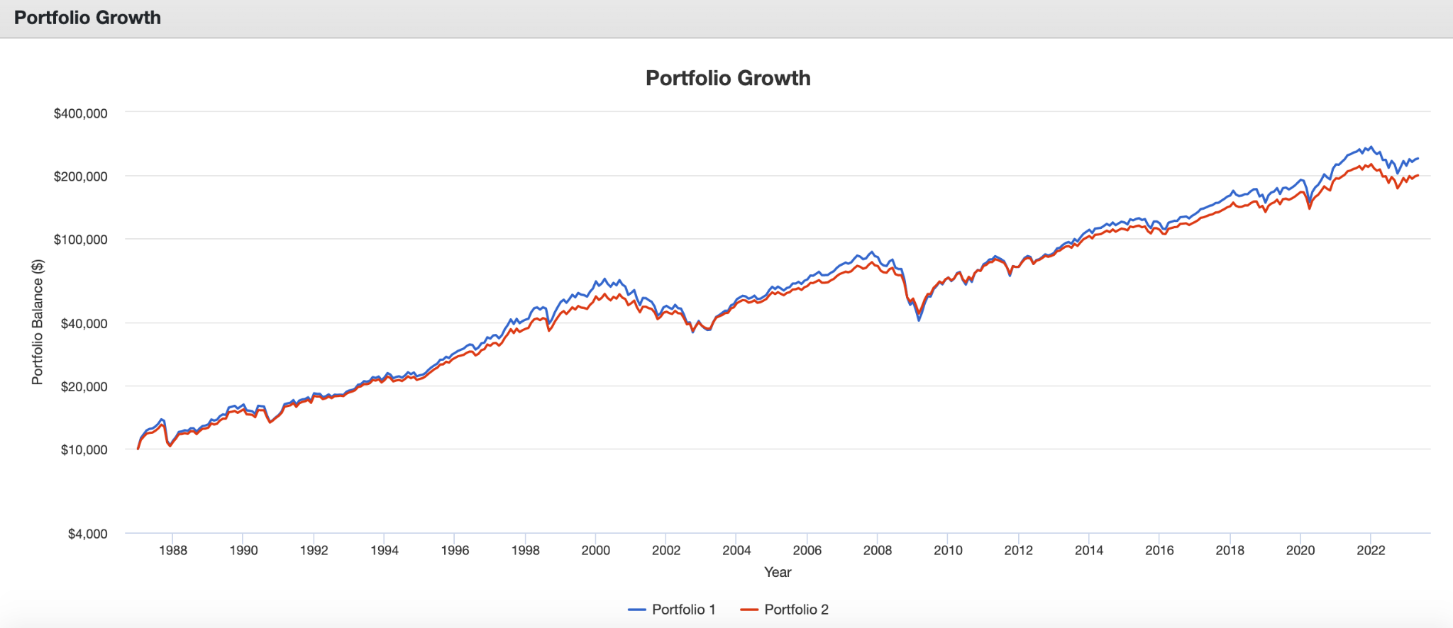
We also get an interactive graph that lets you see from a starting point how much each portfolio would be worth at different points in time. This portfolio in particular only goes back to 1987, as that is the earliest year we have data for all three asset classes.
In addition to asset classes, you can also run backtests on specific funds if you want more precise data on your portfolio.
The downside to backtests is that they can’t tell the full story. As important as it is to know how a portfolio performed historically, this doesn’t mean it will perform that way in the future.
Another downside is that the asset class data only goes as far back as 1972, and some asset classes are much newer. Furthermore, if the funds in a portfolio are relatively new (like many ETFs) you’ll get even less data, making a backtest practically meaningless. The more asset classes or funds you add to a portfolio, the shorter the time period will be as it will only analyze as far back as the newest asset class/fund. If you’re investing for a period longer than Portfolio Visualizer has data for, backtesting probably won’t give you much insight into the relevant time period.
Factor Regressions
I already covered this tool in a recent post, but here’s a review.
The factor regression analysis tool lets you identify which factors an ETF or mutual fund loads positively or negatively on. For example, it can tell us based on a factor model such as the Fama-French Three-Factor Model if a fund loads positively or negatively on value, size or market beta.
The tool will use the Three-Factor Model by default, but you can also use the Five-Factor Model or the Carhart Four-Factor Model, which includes momentum. The default settings will be good enough for most uses. Simply add a fund and run the analysis. For example, let’s look at the Avantis U.S. Small Cap Value ETF (AVUV), my preferred U.S. small value fund.
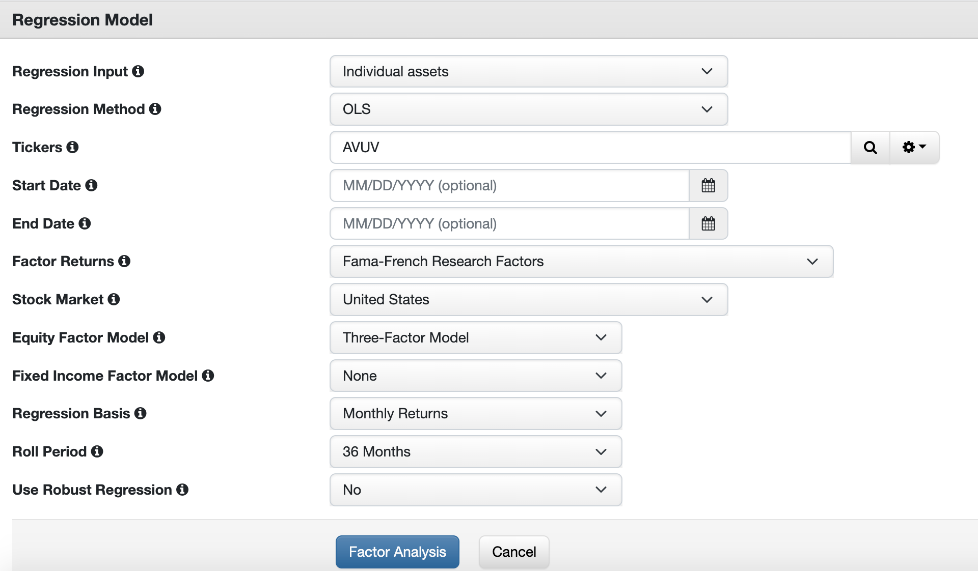
There’s a ton of data that comes back with the results, but the most important is in the Loading column toward the bottom. With a market factor (beta) loading of 1.15, this fund is more volatile than the overall market, which makes sense, as small value stocks are known for greater volatility. It also loads positively on the size and value factors as well, meaning this is a great fund if you want to tilt your portfolio toward small value stocks.

Likewise, you can look into momentum funds with the Four-Factor Model. Here’s what the factor loading looks like for the U.S. Quantitative Momentum ETF (QMOM) by Alpha Architect.
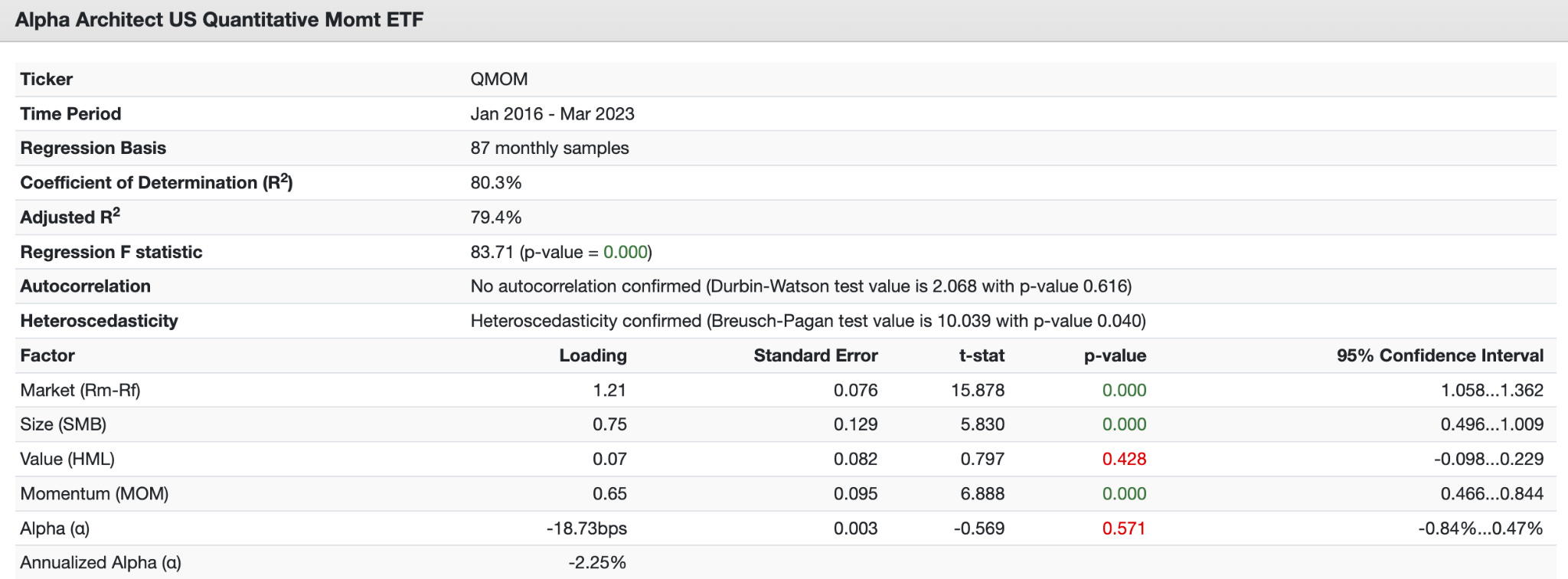
This fund loads positively on the size and momentum factors, and quite weakly on value.
You can use this tool to select the right funds no matter what factor you want to gain exposure to in your portfolio.
Monte Carlo Simulations
Portfolio Visualizer also lets you run your portfolio through a Monte Carlo simulation. When planning for retirement, it’s hard to predict how random variables will affect your portfolio success. We can look at historical data alone, but this doesn’t provide a lot of comfort when it comes time to actually live off your portfolio and so much is on the line. A Monte Carlo simulation helps account for these random variables and gives you a more realistic picture of your portfolio success rate by taking into account thousands of possible outcomes.
A Monte Carlo simulation can be particularly valuable to people nearing retirement. This can help you temper your expectations or tip you off to vulnerabilities in your plan, allowing you to make adjustments.
Here’s what the simulation inputs look like:
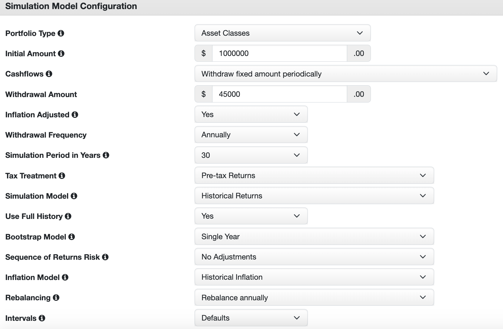
There are a few inputs of note here:
1. Initial Amount and Withdrawal Amount
You can pick how much you want your portfolio to start at and how much you will withdraw annually, quarterly or monthly. You can also choose whether to inflation-adjust your initial withdrawal amount. The default inputs are a $1 million portfolio with an initial withdrawal of $45,000 a year, or 4.5% of the portfolio.
2. Withdrawal Years
You have the option to simulate for periods of between 5 to 75 years in 5-year increments.
3. Pre-Tax or After-Tax
You can change whether taxes will factor into your portfolio withdrawal.
4. Simulation Model
You can choose between a few different simulation model methods, including historical returns, which simply use past asset performance data, and statistical returns, which use the mean, volatility and asset correlations to simulate future returns.
5. Sequence of Returns Risk
If you want to assume that the stock market has a few really bad years at the start of your retirement, you can stress-test your portfolio by seeing how it survives these rough first years. For example, you can change the input to assume that the worst three years in a 30-year withdrawal period all happen first. This is called sequence of returns risk, because bad years at the start of retirement will hurt you more than bad years at the end of retirement, at which point your portfolio has likely grown larger than it started.
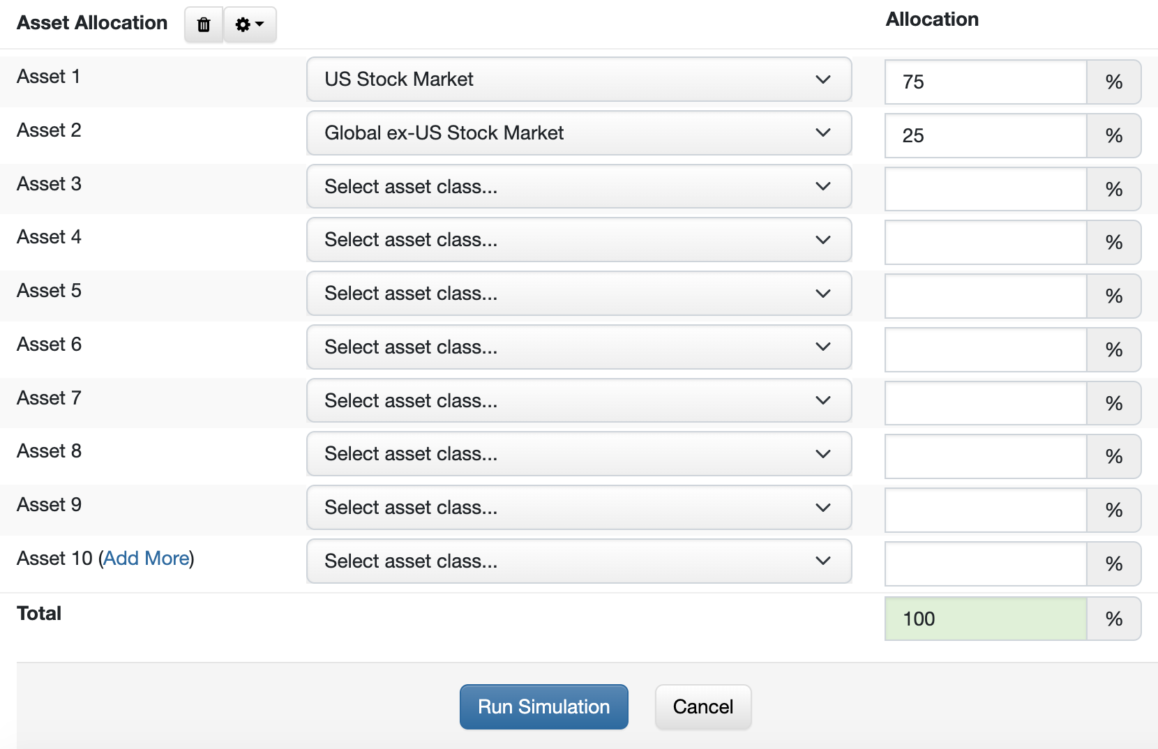
You can choose between asset classes or specific funds, and similar to the backtesting tool, add your portfolio allocations. Here, I’ll simulate a basic all-equities portfolio of 75% total U.S. market and 25% total international with all the default settings:
Let’s take a look at the results.
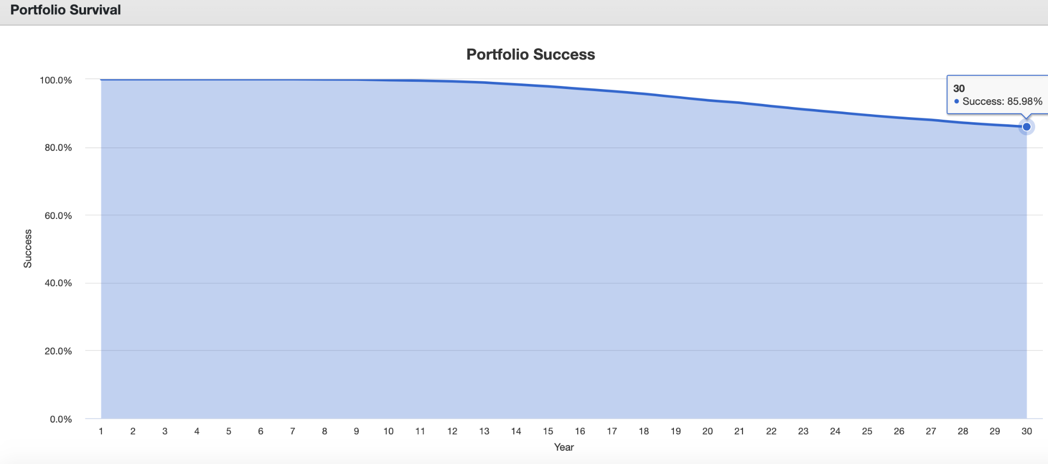
Until the 12th year, the portfolio had a nearly 100% projected success rate. That starts declining, and after 30 years, the success rate drops to 85.98%.
Here are a few more scenarios I got by changing some inputs and how the success rate changed:
Instead of 30 years, I extended the withdrawal period to 50 years. This resulted in a 76.92% success rate. Longer time periods will result in a greater likelihood of failure. This is why early retirement in particular can be so risky.
I assumed the worst year happened first and got a 72.77% success rate. The worst five years first dropped the final year success rate to 15.32%, highlighting how consequential sequence of returns risk can be.
I dropped the withdrawal rate to 3% ($30,000) and got a final success rate of 98.32%.
With all the variables you can change, this is a tool you can spend hours playing with to assess the risks to your portfolio and how you can mitigate them by saving more money, reducing withdrawals, shortening your retirement period or any other number of factors.
Using Data to Become a Better Investor
These tools are a huge help to investors who want a better understanding of their portfolios and how much risk they’re taking on. They’re especially important for those who self-manage their portfolios and don’t get professional advice.
Understanding the risks inherent in your portfolio will ultimately make you a better investor as you see what can go wrong and make changes to your plan. Having data to back up your portfolio allocation will give you greater confidence that you’re making the right decisions.
Having more information not only makes you a more informed investor but also makes you more likely to reach your goals and take appropriate action to achieve them.